We have new neighbors. Ryan, Jessica and their 2 very young kids. They seem very nice and we love having kids in the neighborhood. That said, once they read this they’ll probably have to move to Nome Alaska and leave no forwarding address. My wife just might go with them, and who would blame her?
You see, they just bought the house across the street, and of course are trying to fix it up before they move in. That includes choosing paint. We know this because they made the mistake of being on the street chasing their kids one Sunday morning (clearly they have not read Babies Rule or they would have brought another parent along; who’s going to actually get the house in order?)
They scurry around, try to be nice while their daughter tries to run all the way to (well, who knows?), and then announce that they’re going to simply choose White to paint their house.
That was their first mistake. Their second was not inviting Joanna Gaines and the entire crew from HGTV to make the decisions for them (she’ll choose white; the store has Gardenia but not Magnolia – what will she do?) and then fix up the house so they can sell it again.
But their real mistake was this – THERE IS NO SUCH THING AS WHITE PAINT. I can only hope for the best for them as they enter the Big Orange to choose White Paint and then spend “Six Seven” hours looking at various paint chips trying (and failing) to discern the real difference. They’ll be tired, the kids will be hungry and old enough to enter college where they’ll write a book about the torture of “Agent Big Orange and the White Paint Chips”.
How do I know this? Well, we’re painting our bathrooms white. Consider this picture:
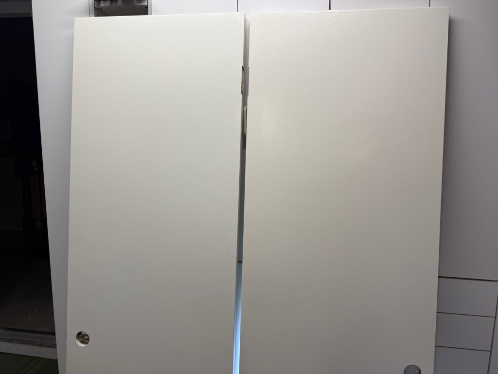
Can’t tell the difference? Do BOTH!
Not Even Close… The door on the left is Cottage White. The door on the right is “Historic White”. Or maybe the reverse; I’m not sure.
You see, we went to a famous paint store and looked at paint chips until we were “Dunn”. For just the white options, in addition to the ones we chose we considered (this is the short list of contenders):
- Frosting Cream
- Wax Poetic
- Pueblo White
- Navajo White (don’t they live in Pueblos?)
- Clearview
- Desert Lily
This is the short list of “white” paint. Their “white” brochure actually has 20 paint chips in it. Who would guess that Droplets or Cool December is a white paint – this sounds more like a weather condition.
And this explains why we brought paint chips to NYC when we visited our daughter. She can make the final decision for her bathroom; we gave up. We served Frosted Cream and Swiss Coffee with salsa (but the paint chip marked Nacho Cheese did NOT taste like Velveeta, nor did it melt very well in the microwave.)
So, yes, we chose two different white paints as you could clearly see from the picture. Which means that I had to put the doors (and trim moulding) onto sawhorses, paint them one color (and mark them so I knew what they were), clean all the brushes, rollers and paint buckets, put the other door on a different sawhorse, pull back the paintbrush, rollers and such, paint those doors the other white (and mark them so I know what they were), clean all the brushes rollers and paint buckets.
And then do it all again for a second coat.
All of that is OK. I knew what I was getting into. We are veterans at the paint chip process for home repair. At this point I could skip painting and just staple the entire wall in the paint chips that I have accumulated over the years.
You see, some 15-20 years ago I decided to fix up our master bedroom. I put up wainscoting, chair rails, crown moulding, door moulding and baseboard moulding all bought at the World of Moulding (really, this exists; next I’ll go meet Weird Al at Spatula City.) No, I have no idea why they spell moulding using British grammar rules that Siri does not recognize. In any case I made the clear mistake of asking my wife “what color do you want on the walls?” She announced that she wanted a very specific shade of Blue.
So I went to the Big Orange, went to the blue rack, and chose a bunch of blue chips (blue tortilla chips to be specific.) I brought all 14,300 samples home and not a single one worked. So, I went back. And back again, And then BACK AGAIN. Too dark, Too Light, Too Blue, Not Blue Enough….. commence arguments NOW. The accumulated number of paint chips could have been stretched from LA to Pittsburgh. And back. The guy at the paint desk simply shook his head knowingly when I returned.
But here’s how my wife broke the stalemate. She picked up a Pottery Barn catalog and turned to a page where tasteful Pottery Barn furniture is set inside someone’s personal library. Among the something-like 20,000 book spines on the shelves (in the background), she isolates one particular book. The picture is about 1 x 3 microns and only visible with powerful microscopes (this is not a joke; we actually did use a magnifying glass to study the catalog). That is the color she wants.
So (and I am not kidding here), I take the magazine and magnifying glass to the store. I match it up to all the blues with no luck. Then I look at the greens; yep, there it is.
Vermeer. You know, the Dutch Golden Age Painter (1632-1675) renowned for tranquil domestic paintings (I so obviously copied that from Siri.) That’s the color that adorns our wall; the one we wake up to each morning and promise that we will never paint again. I say it’s Green since it was in the green row (as in “we had a row” over green.) My wife insists it is Blue (and she is wrong, but I will not tell her that to her face; that’s what I have you for.) This choice of paint color will be an unresolved marital issue for the rest of our lives (mine will end if I have to repaint, so place your bets sports fans!)
Which, after about 1,500 words, brings us to the real point of this whatever-this-is. Vermeer? How the heck do these people choose the names for colors? Are they in fact eating paint chips?
I say this loudly at the store (and with a bit of jealousy; I want this job.) Really, I had that mental breakdown – this actually happened as I waited to buy white paint.
I’m standing behind someone at the counter, chip in hand, to order Cottage White. I notice that they have their version of the academy awards – Paint Color of the Year. It is Midnight Garden. It’s a lovely shade of green. I absolutely lose it; hysterical laughter fills the room.
The clerk looks at me, calls for their attack dogs, and wonders why. I tell her this:
“Midnight Garden– I don’t know about you, but when I go into the garden at midnight it is, follow me here, black.”
She breaks down. It turns out that she is not a clerk, she is a “Color Specialist” – a person in the store that helps you pick out between the various shades of white, green, and so forth. It is her job to explain these colors to mere mortals such as myself. My comment was some sort of epiphany – not only does she laugh, but she also decides that she should help me understand the pain of her job.
She hands me a brochure that outlines the 2026 Color Trends (mind you it’s still 2025, but they’re about a year ahead of me). And the cover is, of course, Midnight Garden.
And we had a marvelous time with some of the names
- Viridian Odyssey – nothing says “Home Sweet Homer” like viridian. BTW, they describe this color as “blue green”. NO not Vermeer!!!!!!!!!!!!!!!!
- Country Air – A nice shade of light blue. But I took specific note that they don’t have City Air as a color (it’d be in the brown category here in LA).
- Eagles View – Apparently, ornithologists the world over have decided that eagles view everything in dove gray. I have no idea what a Dove’s View would be.
And my personal favorite: Outer Boundary. As in “we have outer boundary problems” with our neighbors. The color is actually a blood red color. Seems fitting.
I can only hope that our new neighbors will someday welcome us into their home for a glass of Sonoma Chardonnay (color number DET471). I won’t ask them to put it into a Milk Glass to be served with either Apple Cinnamon or French Press Coffee.
I’m just not that trendy. Now on to pick grout colors for the bathroom floor…..

Leave a comment